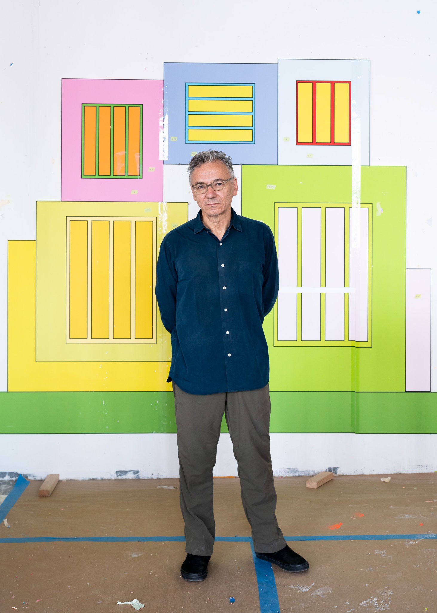
PaperCity invited Beverly Acha, artist and assistant professor of Art at the University of Texas at Austin, to interview Peter Halley to get to the heart of his new work on view at Dallas Contemporary. Acha and Halley met in 2010 at Yale where Peter headed the Painting and Printmaking MFA program, and Beverly was a student.
Beverly Acha: I’m so excited that you invited me to interview you. We last saw each other in 2019 when I went to hear you give a lecture about narrative and abstraction in your work at the Wexner Center for the Arts at Ohio State University. That talk was wonderful and brought me full circle to my time at Yale. I had teachers there, you included, who were thinking about abstraction in ways that echoed how I approached it in my own work, and hearing your talk really clarified that for me. This linked approach to abstraction emerged in critiques and conversations in the studio but never directly via your work.
Peter Halley: I always thought my role as a teacher was to leave my own work at the door. I wasn’t the kind of teacher who tries to promote his point of view.
BA: How did you approach leading the program? And how did it relate to your practice?
PH: I’d been an undergraduate there in the 1970s, and even when I arrived in 2001, I felt it was still a very unhappy place. I used to hear that students felt their real work would begin when they got out of Yale. There was a certain kind of distrust about the institution. It could also be a harsh and very judgmental environment.
I felt my goal was to make it a more supportive environment, an environment in which a full diversity of views was encouraged. Keeping away from saying someone’s work should be this and not that. Not only diversity about people but diversity about ideas.
When I got there, every week there would be a lottery for which students would get to meet the visiting critics that week. Everybody would be so nervous. Somebody would end up getting last choice four weeks in a row. So I set up a system where we assigned all the numbers at the beginning of the semester so that everybody got first, second, third and fourth choice in rotation. It just seemed like a simple way to make people more comfortable. What I finally came away with, thinking about any kind of leadership role, is one very important principle: “Don’t be a jerk.” [Laughs.] Works like a charm. Regrettably, as we’ve both experienced sometimes, people who teach art can be a bit insistent or arrogant about their own take on a student’s work. Like: “I would never be interested in this.”
BA: I learned the most from the critiques, especially hearing the faculty debate about what they were seeing and how it was related, and all the references the work conjured for them. This then led to generative discussions among the students after critique.
PH: The debate that takes place in group critiques is, I think, one of the strongest things about Yale. Another unique thing about Yale, which is probably different from the University of Texas in Austin or Columbia in New York, is that forty students arrive from all over the world and are then stuck in New Haven, Connecticut, for two years with basically nothing else to do. The studios are all in the same building, and everyone is there all the time. It’s a very intense experience.
BA: Yale’s MFA program has a reputation for developing important contemporary artists. As a director of the program, did you see yourself shaping contemporary art in a way or having a role in that?
PH: Not really. One can only hope. My main focus was trying to convince people not to be trendy, not to just do what was popular in the galleries and the marketplace, and help people develop some sense of individual integrity about their direction, because that’s the only way anybody’s ever going to be successful.
BA: One of the things that struck me during my first semester in Austin was how tight knit the contemporary artists were there compared to other places.
PH: There’s a certain group of creative people who say that living in a place like New York is too difficult, and that places where exciting things are happening are the smaller cities, like Portland, Seattle, maybe Chicago, maybe Detroit, Philadelphia. Do you have a view on that?
BA: Before moving to Austin, I lived in Oberlin, Ohio, and the year before that I lived in Davis, California, a town outside of Sacramento. It was affordable to live in these places, but it also came with the challenge of not having a large or diverse artist community to engage with. As an artist, if you can afford to make your work and live a full life, in one way it’s going to be richer than if you are constantly battling to have enough time in the studio and income to pay rent, healthcare, etc.
PH: Also, no matter where you live, you are in the age of social media and other kinds of connections, it’s different than it was 20 or 30 years ago.
BA: It certainly makes connecting with artists outside your geographic area much easier.
PH: Some of my favorite artists have never lived in New York. From Yale, Mary Reid Kelley – she’s in upstate New York. Back in the 1990s, when I first saw Ellen Gallagher’s work, she lived in New England. It’s really interesting to follow how people outside of New York form their careers. Another prominent artist is Titus Kaphar. He went to Yale too, and he stayed in New Haven. Recently, he’s opened an arts center and residency there. They even built their own building, and he recently received a MacArthur Grant, yet he has never lived in New York.
BA: It’s interesting to hear this from you, especially as someone who I consider to be such a New Yorker.
PH: You probably don’t know this, but I lived in New Orleans for six years in my 20s. I moved there during college and really fell in love with it. I loved living and working there. I eventually moved back to New York, partly because I felt it was too far away and the arts community in New Orleans was too limited. But at first, I thought I could do what I wanted as an artist in New Orleans, although the arts community was so conservative.
BA: Why did you feel that way? Was it something about the environment?
PH: It’s an enormously rich cultural environment. I find the city really beautiful and historically resonant. To be honest, the fact that it is more relaxed and super tropical, with all this hot, humid weather … believe it or not, it seems to be conducive to my work. I was very comfortable there. It was a very sensuous environment. Full of color and greenery, beautiful houses, etc. And Mardi Gras craziness, that sort of thing.
BA: The way you just described New Orleans’ environment – the air quality – I can relate, Miami’s weather is the same. The humidity makes it feels like there is no negative space, like the air is solid, pressing on you.
PH: You can swim through it.
BA: You’ve made a number of installations recently: in early 2019, you were working on Heterotopia I, which was the installation you did in Venice during the Biennale, the Lever House installation was the year prior, and Heterotopia II at Greene Naftali in New York in late 2019, which I was able to see. The color in your installations operates like the humidity, pressing on you, changing the space. Actually, Heterotopia II made me feel like I was inside one of your paintings, feeling the color as oppressive and vibrant – a real sensory experience.
PH: That’s a wonderful compliment. That’s a great reading. I’m so glad you saw that.
BA: It was also interesting that the paintings hanging within the installation became like windows, allowing for a way “out”. They were an escape from the intensity of the installation space’s electric color and also simultaneously mirrored the space, functioning like a diagram of the installation. It really struck me how deeply you’ve always thought about architecture through your paintings. Has creating these complex installations in turn influenced your paintings?
PH: For a long time, I’ve been interested in how you encounter two- dimensional paintings in three-dimensional space. You know, in Baroque churches, in Tibetan temples, there are all sorts of examples of that. In an Egyptian tomb, you walk through a passageway, and you encounter an image. And the relationship between moving through space and encountering images, which we also do walking down the street in a city or passing billboards on the highway, it’s really interesting to me. So, I’ve tried to make my installations about that: how you encounter images in an architectural setting and change the architectural setting to host the paintings.
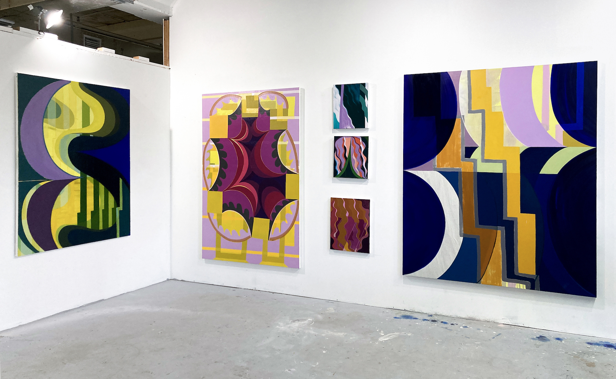
Dallas Contemporary is an enormous space. I felt that if the paintings were just hung on the outside walls, it would have just been an enormous empty room. So, I built five cubes in the space and hung the paintings on these white cubic solids so they faced each other and could interact. Each cube is 10 feet tall and 14 feet wide, and they are lined up so it feels like a street. I think of it as a kind of simplified model of New York City.
BA: When I saw images of the exhibition, I thought it was your standard white exhibition space with paintings in it. Then I realized that there was an architectural intervention on your part shaping the way people move through the space.
PH: They build something for almost every exhibition. But the idea of two- dimensional grid paintings on three-dimensional cubes definitely appealed to me. The rows of cubes created interesting sight lines so you could see a number of paintings at once.
BA: In an interview you did with Kathryn Hixson in 1991, you said: “I have always considered my work to be pictures of things in some way or another. I’ve never really quite understood abstraction.” I really loved this. I also relate to abstraction as linked to the world and its things, not something outside of it.
PH: I have one of your paintings from your recent show in New York in my library in Connecticut. That painting has both a space that you can enter and it’s a kind of model of space, as well. Is it an abstraction of something, a simplification of phenomena in the world? Or is it a picture created in the mind? That’s another definition of abstraction.
BA: For me, diagrams have a strong link to abstraction. I see them as images of things or phenomena that you can’t experience physically in a whole or complete way due to being in a body. Maps are a perfect example of this. I see your painting as diagrammatic, do you?
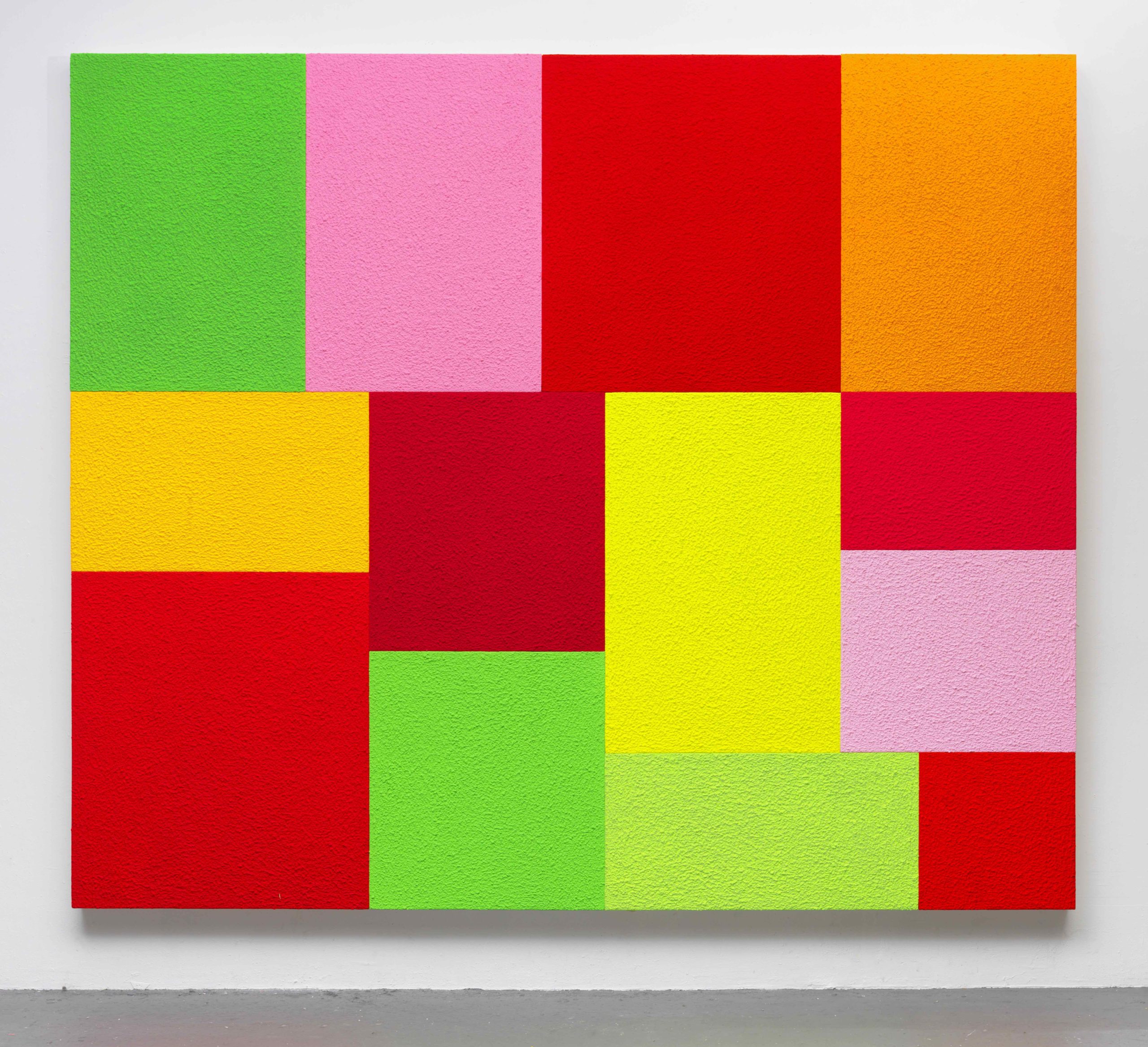
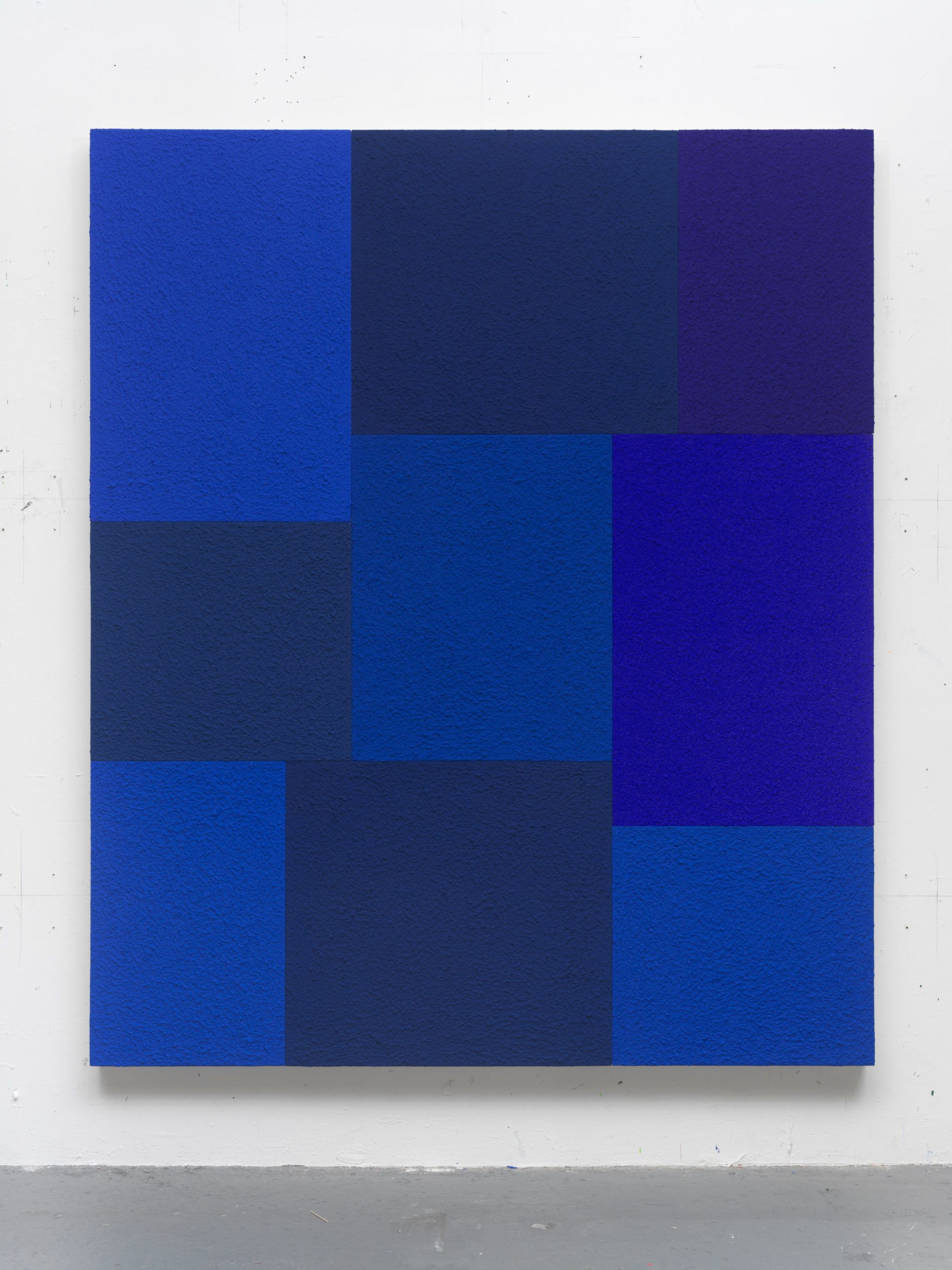
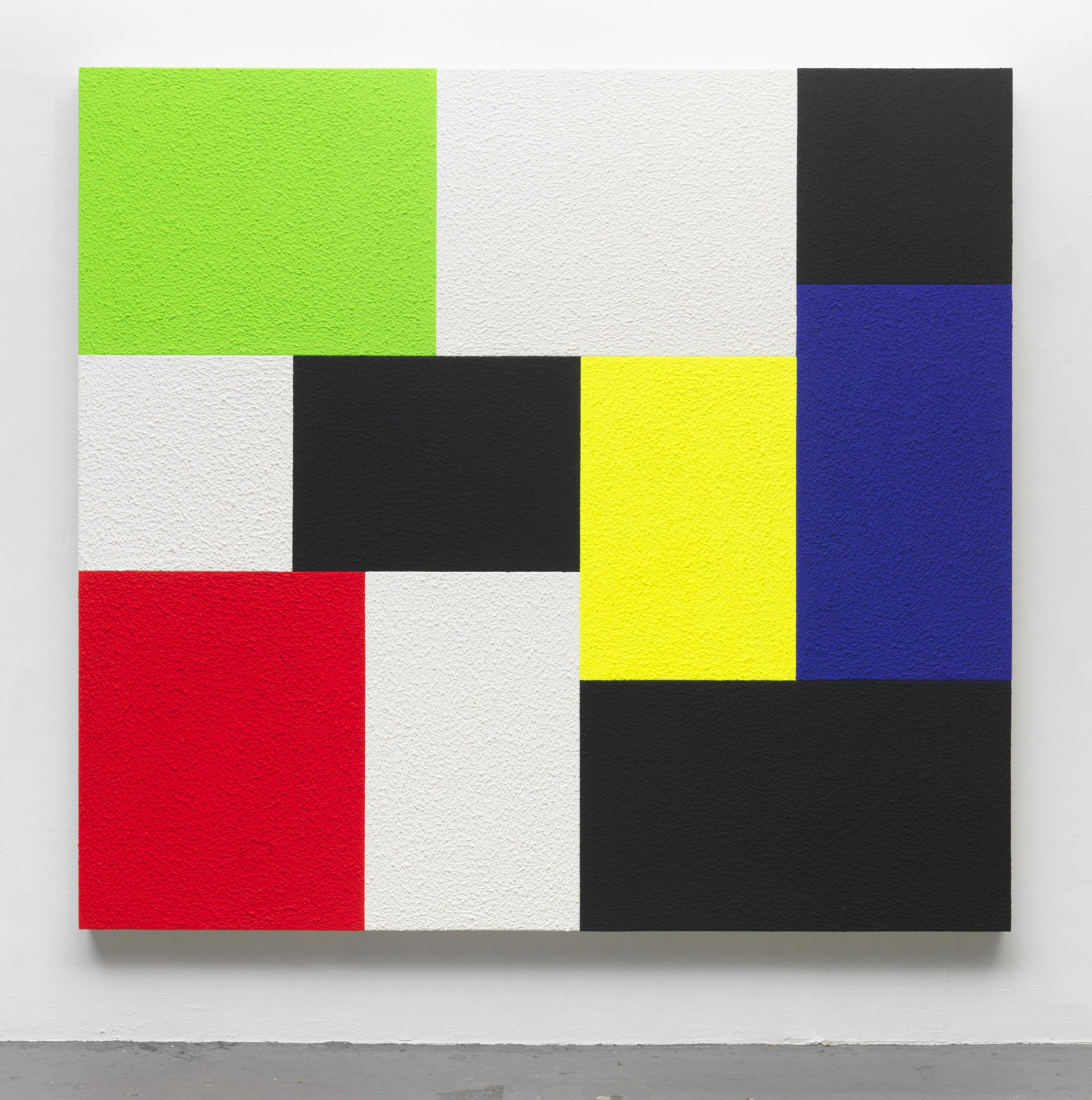
PH: I see my paintings as diagramming the way space is laid out in our culture – from city grids to microchips. But these grid paintings come pretty close to looking like abstract paintings. But they are not rectangles painted on a single canvas. Each is a separate canvas covered with a fake stucco material called Roll-a-Tex. Then the canvases are all bolted together. I call these rectangles “cells” because I see them as enclosed spaces. It might be hard to convince people that it’s a grid of cells squashed together since they really do have associations with Modernist painting, but I still think of them as cells squashed together.
BA: The paintings in “Cell Grids” were created across multiple years, right?
PH: They started in 2014.
BA: And you continued to make them. There are some from 2020.
PH: There are two from 2021.
BA: I didn’t realize from the images of the show that each painting was made up of multiple canvases – that they’re assembled. I find that their color operates similarly to how I described it in Heterotopia II. The color works to push and pull, creating spatial tension and a dynamic experience of the pictorial space.
PH: Well, I promise that we did not rehearse this in advance – because when I talk about these paintings, all I talk about is this idea of push and pull. If you look at the earliest paintings in the first room, you’ll see that I was using Hans Hofmann’s palette, which is orange, green and yellow. It was totally unconscious.
BA: Is there anything else about the work in the show that you want to discuss?
PH: There are three or four groups. The first group of older paintings has this Hans Hofmann palette. In the second group there are a bunch of monochromes. One painting is almost black, there’s a blue one, and then there’s a red one.
Next, there’s a room with paintings actually based on Mondrian, which I did for a show in Paris, that use primary colors along with black and white. Then, for the final more recent work, I just really let go and made it my business to use almost the full color spectrum.
You know, these paintings also involve a problem seen in map making. If you’re making a map of the United States, how do you make it so that no two states have contiguous colors? How many colors do you need, how do you distribute them? In a way, even though the paintings are about push-pull and luminosity, it’s also about how you juxtapose color along these contiguous rectangles – just like a map maker. So it becomes a little bit of a puzzle as well.
BA: The work in this show made me think about your Instagram account, which is all aerial views of the Earth. It’s this gorgeous study of grids as surface, grids as map – and also invokes Mondrian.
PH: I haven’t been working on it lately, but I did do it for at least five years. I’ve always been interested in satellite imagery – things on the Earth photographed from above. When I was young, all of that satellite imagery was top-secret military stuff. So, all of a sudden, when Google Earth came around, I was totally enthralled. Then when Instagram started, I felt strongly that I didn’t want to give this media company my photos. So, if I was going to post something, I was going to give them Google’s photos. The idea was that Google could fight with Instagram about who owned the photos since Instagram says that they have the right to continually use them. On theoretical grounds, I was very much against that.
BA: I’ve become increasingly interested in the role of doubt in the artistic process: doubt’s general presence, sometimes debilitating in nature and sometimes generative, leading one in new directions. I think of you as someone who is confident and sure of their practice and framework, so I’m curious, in what ways does doubt appear in your work and/or in your process?
PH: I guess when one gets older, one does get more comfortable with oneself. When I was a younger artist, there were some very tough moments. The first was after I took a year in New Orleans and came back to Yale for my third year and wanted to be an art major. They wouldn’t admit me to the art program. They didn’t like what I was doing, and they said, “You can’t major in art.” So, that certainly sowed some seeds of doubt.
In my early years in New York, in the first half of the ‘80s, I was doing paintings with these Roll-a-Tex surfaces and a very simple, childlike vocabulary. People would say to me, “This is just old-fashioned minimalism; this isn’t anything interesting.” I was committed to what I was doing but felt it was outlandishly dumb until I began to get some positive reinforcement about the direction I was taking. There were several years when I felt a whole lot of insecurity and fear that what I was doing was either of no interest to anybody or it was so embarrassing I had to keep it to myself.
I think I’m lucky that the approach I’ve taken to image making, which I do think is very childlike in a way and is in some sense out of touch with the times – has had a wide reception. It’s miraculous to me. Generally speaking, I think it involves constant questioning and self-criticality, which I guess is a little different than doubt but it’s on the spectrum.
“Peter Halley: Cell Grids,” on view at Dallas Contemporary through Sunday, March 13, 2022.
All artwork images © Peter Halley and © Beverly Acha.