How We Color Drenched Our Dallas Home in Farrow & Ball’s Most Practical Paint Yet
The Beloved Brit Brand Adds Instant Sophistication
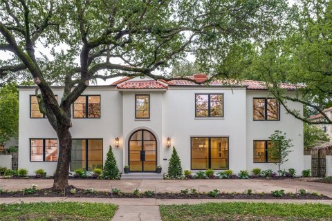
BY Caitlin Clark //Farrow & Ball's Hague Blue and Wevet welcome guests to the Dallas home.
Moving in with your partner is fun. There’s so much to discover, so much to learn, and so (so) many decisions to make — some easier than others. For every gentle debate over which houseplant should go where, there’s a war of the words over couches in Crate & Barrel. But there was one decision that was too precious to leave to just the two of us: paint colors.
After purchasing a home in the heart of Lake Highlands, we hired a contractor (we lucked out finding the wonderful MJ Workforce Solutions on Thumbtack) to replace almost all of the original 1960s drywall. When owner Maidelys Jorge presented the typical Sherwin Williams eggshell to finish off their gorgeous work, we realized that, after years of all-white everything, we were ready to shift gears into something richer.
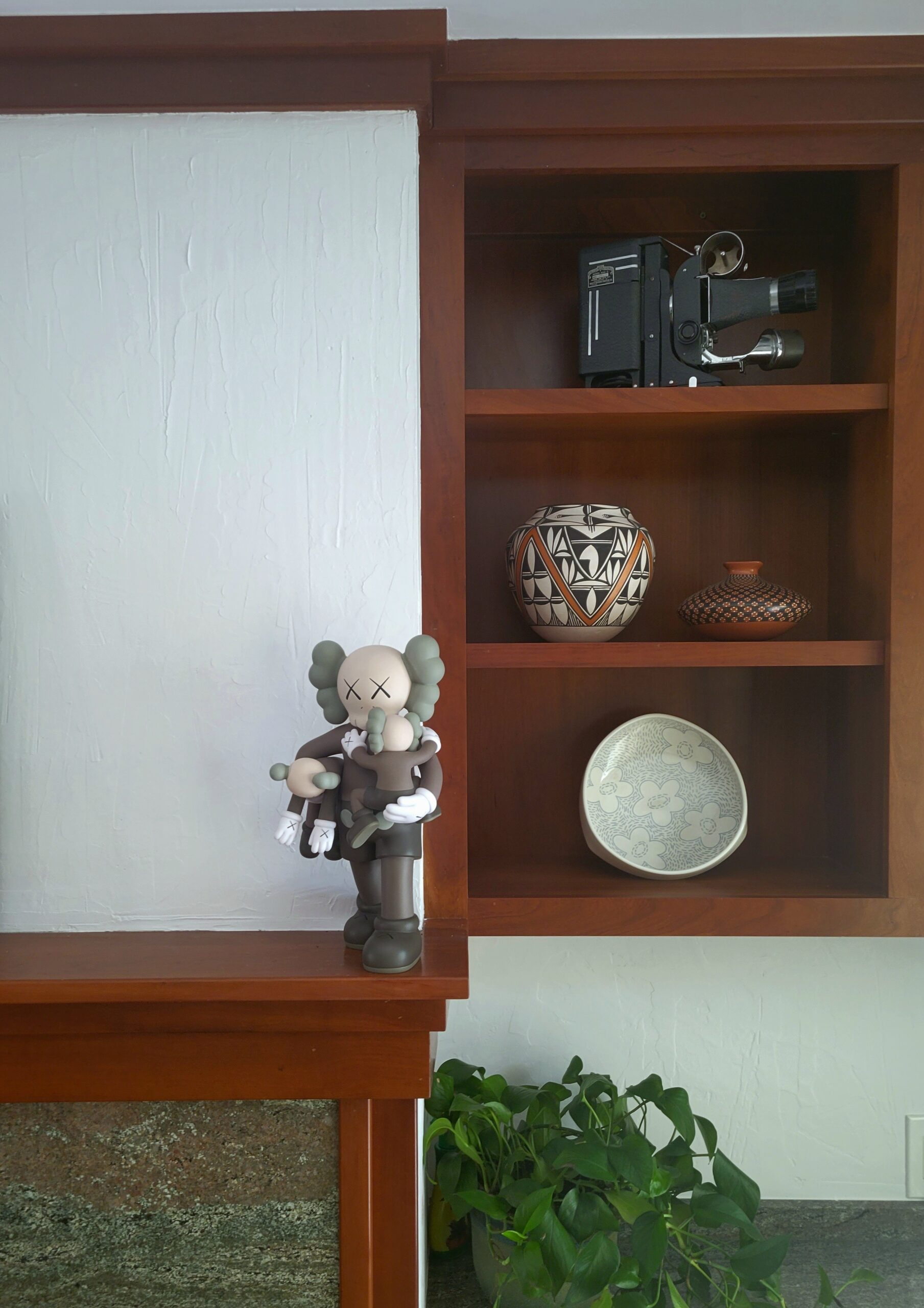
Though the home looks traditional from the outside, almost every room is lined with a thick wood trim that creates a Craftsman feel throughout the interiors. We wanted bold, moody colors to lean into the richness of the wood, but more than anything, we wanted a professional to guide us in the right direction. Thankfully, Farrow & Ball, the Brit brand raved about for its highly-pigmented paints, opened its first Texas showroom in the Design District in 2021, a fact that gives Dallas unique access to the company’s coveted in-home color consultations.
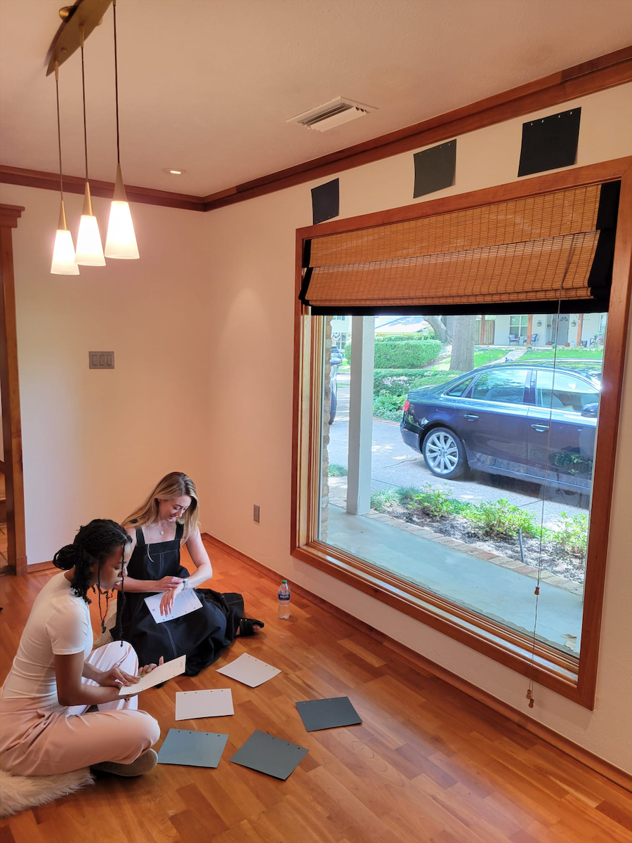
We booked the service and within just a couple days, the Dallas showroom’s effervescent color consultant, Demaudecia Taylor, came to our rescue with bountiful swatches and interior design knowledge.
Our timing also could not have been better. Just about a month before the consult, Farrow & Ball had launched their Dead Flat finish — but more on that in a bit.
A Different Kind of White
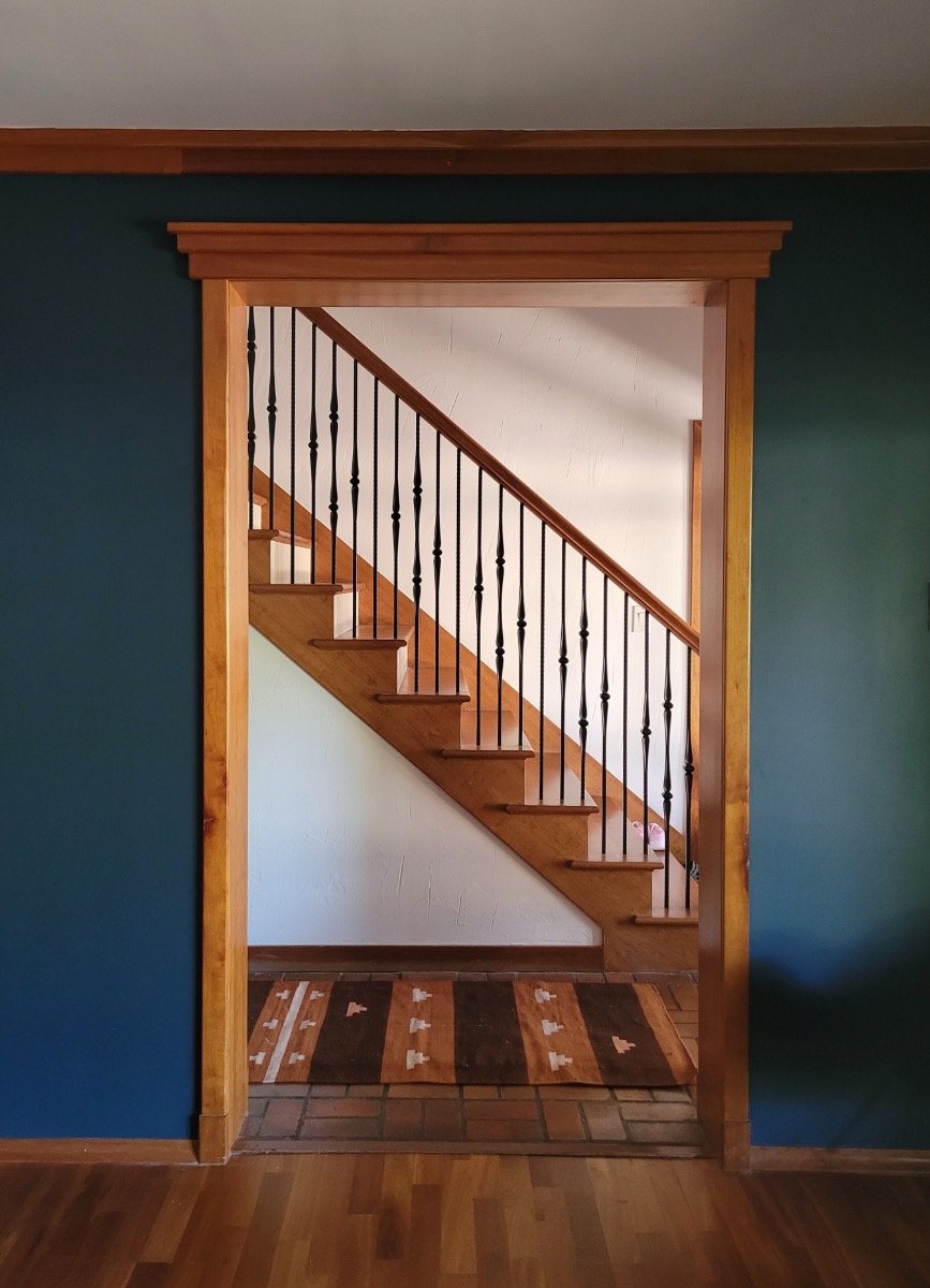
Demaudecia’s first suggestion was — oddly enough — white. The family room is at the center of the home, a location that also makes it the darkest room in our house. But the suggested color, Wevet, wasn’t just any white. It’s a brilliant white that puts every other eggshell hue to shame.
Our trust in Demaudecia paid off. We loved how it turned out so much that we painted the hallways and stairwells in the same gloriously matte hue, which feels far sexier than a typical, more clinical white.
A Moody Dining Room
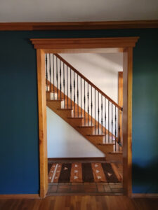
OK, now onto the color. As aspiring entertainers, we wanted the front room to be a dining-slash-bar area that leaned into the darkness during the day. I was gravitating toward dark green. My partner wanted dark blue. With much guidance from Demaudecia, we finally found our moody match in Hague Blue, a deep blue with green undertones that serves as a complement to Wevet. Everyone wins.
Now, I don’t like to pick favorites, but if forced, I would choose this Hague Blue room every time. It’s probably the reason there’s still barely a lick of furniture in the dining room weeks later… the bar is simply set too high.
A Modern, Feminine Office
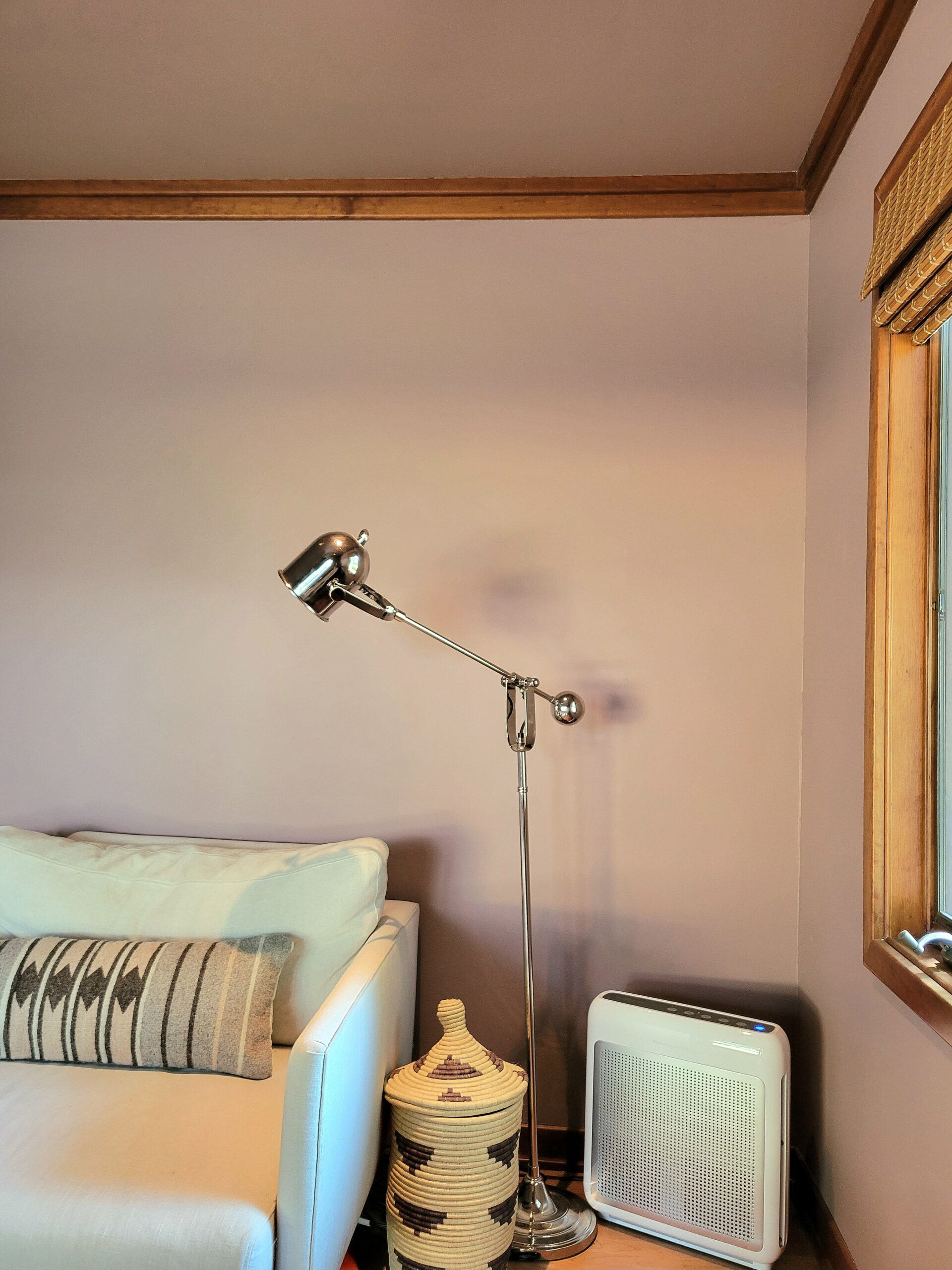
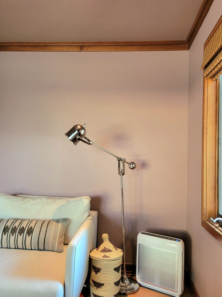
My partner is what you might call an extreme extrovert, and while I’m not some sort of hermit, I do prefer to recharge alone. For me, my office wouldn’t just be a place to work, but a haven within our home. Farrow & Ball’s Sulking Room Pink, a muted rose color reminiscent of classic French boudoirs, was the only color I considered once Demaudecia presented the swatch. We wrapped the whole office in it (ceiling and all) like a little jewel box.
I love the way the room changes colors with the light throughout the day. Everything, even an air purifier, looks good in Sulking Room Pink.
A Playful Kid’s Room
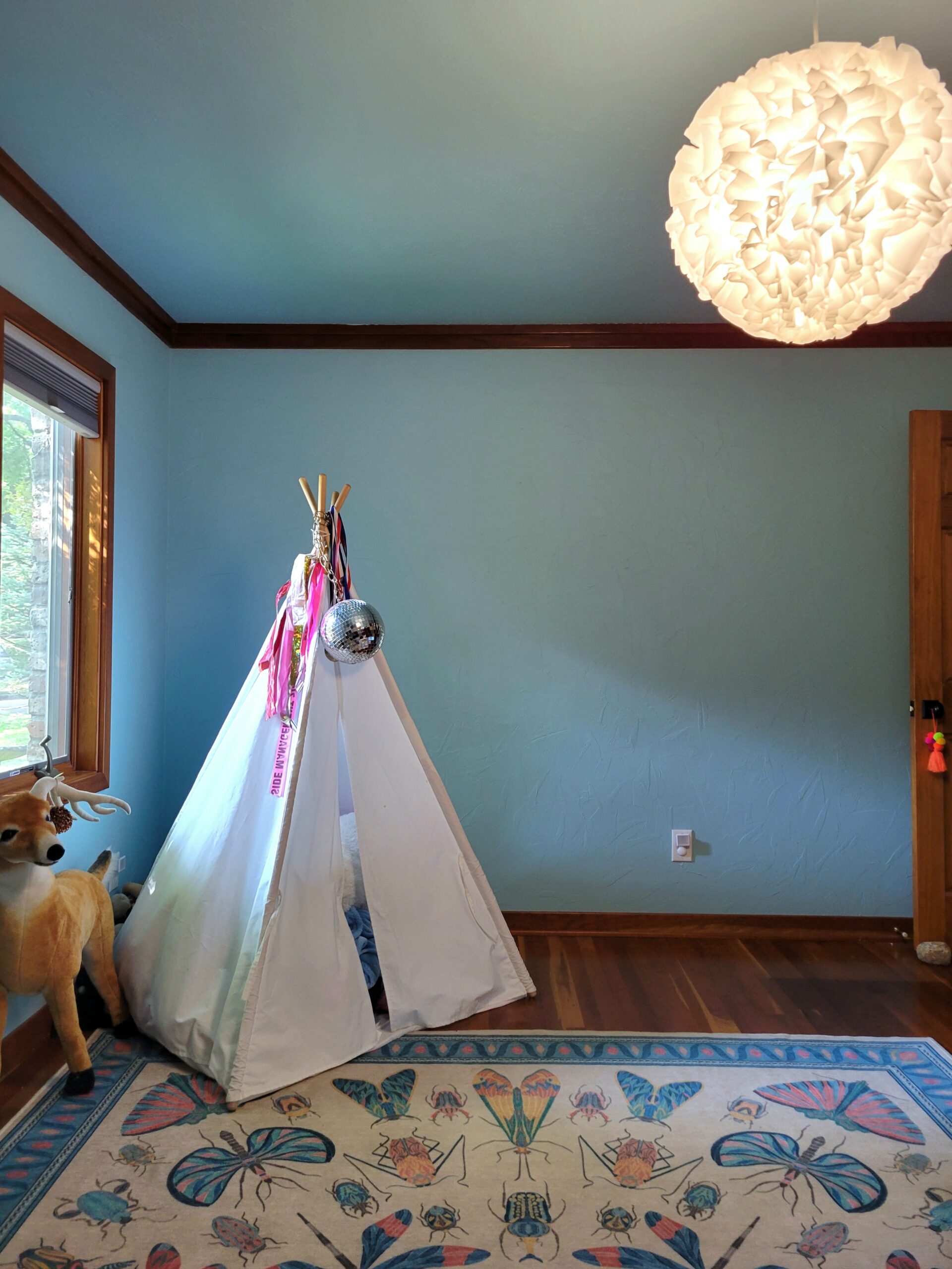
Confession… this is the one room we didn’t redo the drywall in. (She’s only 6! She’ll redo her room in a few years anyway!) To make her feel included though, we bravely let her choose whatever color she wanted to paint her room. Lucky for us, she has great taste and picked Blue Ground, a warm, elevated spin on the typical turquoise young girls often gravitate to. Even luckier for us, the choice worked ludicrously well with the Iris Apfel x Ruggable area rug we had already purchased for her. The color gods were truly on our side.
A Diminutive But Cozy Primary Bedroom
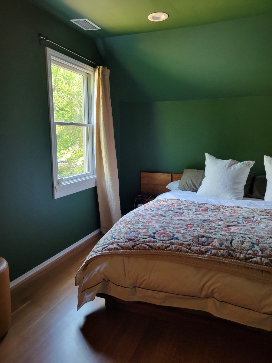
Thanks to Demaudecia, no fighting took place on the Big Day of Paint Decisions 2023, but if a brawl were to break out, it would have been over the color of the master bedroom. Though we both agreed on green, just how verdant we would go was up for debate.
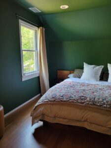
I found myself drawn to the brighter Card Room Green and more olive-like Bancha, while my partner insisted on the more forest-green Beverly. It took a few days and a couple of Farrow & Ball sample pots (available for $8.50 each at the Dallas store), but the richer Beverly won out in the end — a result I’m reluctantly grateful for.
The color (poignantly named for a former Farrow & Ball team member) feels bold in the daylight but warm and comforting against the glow of our bedside table lamps. Given the curved ceiling, Demaudecia recommended painting the entire room, which makes the whole space feel bigger. With Farrow & Ball paints, you don’t have to have to be afraid to go dark.
The Dead Flat Difference
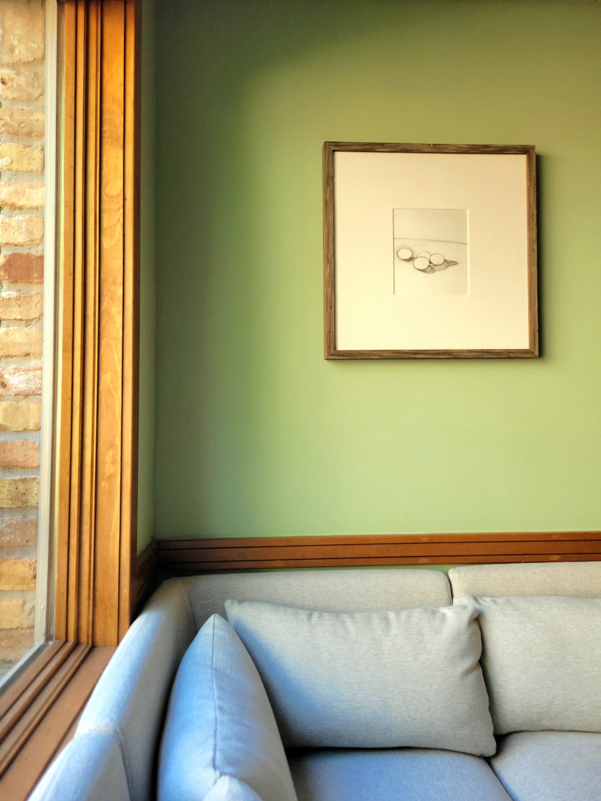
A lot of things about the way we found and bought our home feel serendipitous, including the fact that Farrow & Ball’s Dead Flat, a paint finish five years in the making, was released just a handful of months before our paint project.
Billed as an “incredibly durable, ultra-matte finish” that works equally well on walls, woods, and metals, Dead Flat mimics the painstakingly layered “flatted lead” look that was popular for formal reception rooms in the 18th century. The finish also promises to be “scrubbable” and “scuff resistant,” a claim we have absolutely put to the test in the handful of months since the paint dried in our home.
We’ve had a few slight scuffs here and there (many a 6-year-old runs through our house), but the real moment of truth was when a tricky cork spewed red wine all over our white-painted ceiling. With a few swipes of a Magic Eraser, our worries disappeared as quickly as the Pinot Noir. It was a technological wonder to behold.
Benefits of the Farrow & Ball Showroom in Dallas
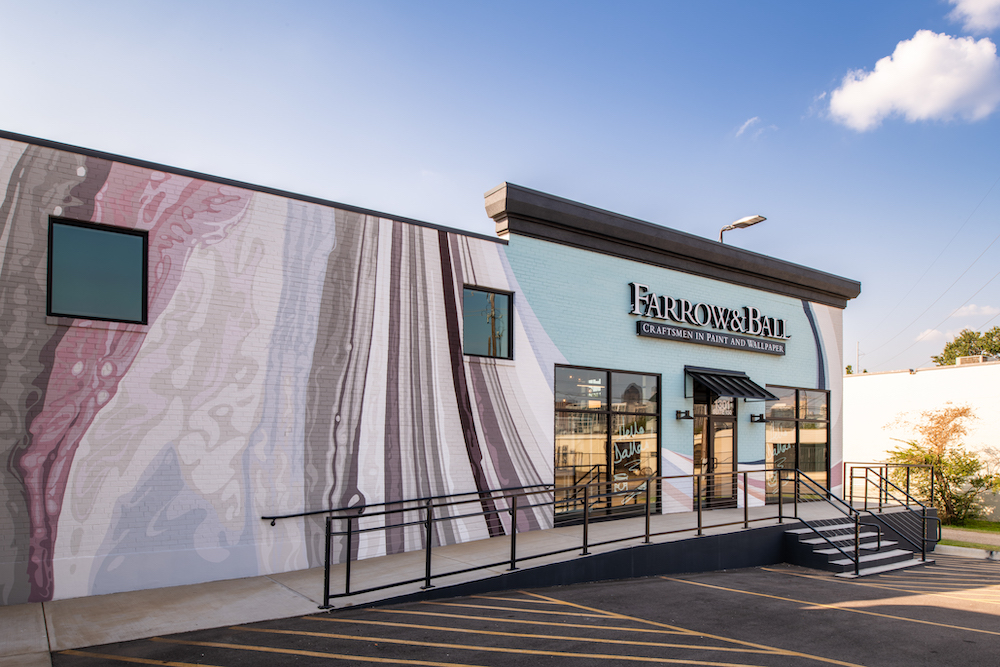
Dallas has had access to Farrow & Ball paints in the past thanks to stockists like ARTIFKT, but when the Design District became home to the first-ever showroom in Texas (or anywhere in the South for that matter), it gave the city far more than easy access to sample pots.
There’s the option for an in-house Color Consultation (or Colour, per the Brits), which helps you paint with confidence. All Farrow & Ball consultants are available virtually, but having an expert walk the space with you, see the way the light hits, and be able to compare paint swatches was invaluable (although consults priced at $300 an hour). Simply put, our home wouldn’t be what it is today without Demaudecia.
But the showroom also offers a physical destination to explore Farrow & Ball’s many buzzy collaborations, which have included limited edition color runs from Kelly Wearstler, equally revered Brit brand Liberty, and The Rug Company. As of September 7, Dallas will also have easy access to Farrow & Ball’s newest collaboration with Christopher John Rogers, a celebrated fashion designer who’s dressed everyone from Beyoncé to Sarah Jessica Parker. Featuring 12 playful shades, the Farrow & Ball x CRJ collection, entitled “Carte Blanche,” is inspired by his childhood in Louisiana. (Needless to say, food has a huge influence, particularly in colors like Shallot and Raw Tomatillo.)


















_md.png)
_md.jpeg)


